Project OvervieW
The product and problem: Mokita is a therapy-ordering app that quickly matches Black women with mental health professionals specializing in their mental and identity-based needs. Searching for a mental health professional that addresses a person’s unique needs can be time-consuming. It is often an arduous process that discourages users from following through and achieving their goals. Mokita addresses this issue and streamlines the process for those in need.
The goal: Mokita will allow users to match with mental health professionals quickly. Users can state their needs and symptoms to find qualified mental health professionals. I will measure effectiveness by tracking the number of matches and sessions held monthly and the drop-off rate during sign-up.
I created a product and problem statement to clarify what the app was, who it was being built for, and why users would use it. I also made lo-fi concept sketches to start considering the product’s architecture. While the lo-fi concept sketches may not have matched my final product, they allowed me to start thinking about the app on a visual level so that I could iterate as I carried out the rest of the design process.
Research and Analysis
My next step was to understand the user and landscape. I needed to empathize with the user. To address the user’s needs, I needed to talk to the demographic for which the app was being created. I also needed to study the current market to assess what current products were doing and gauge whether there were any market gaps. Ultimately, conducting as much research as early as possible could save me a lot of time later on.
There were a few key things that I wanted to achieve through conducting my research. I wanted to create user personas, problem statements, and user journey maps. Doing this would help me get a thorough understanding of the user that I was making the product for. I would be able to pinpoint their pain points and ensure that my app was designed in a way that would help guide their journey.
I conducted individual in-depth interviews to collect qualitative data from my target user—this methodology aimed to assess users' needs, motivations, fears, and behaviors. Due to limited resources, I could only interview three women for an hour per woman remotely. All of the women were professionals between the ages of 21 and 40.
I asked the following questions:
1. Tell me about how you learned about mental health professionals.
2. Tell me about your experience while finding a mental health professional.
3. How often have you tried to seek a mental health professional online? When you do, what is your motivation for doing so?
4. What challenges do you face in the search process? How does this make you feel?
5. Is there any way in which these challenges could be resolved?
6. Tell me what you seek when seeking a mental health professional.
7. How long did it take you to find the last mental health professional you contacted after searching online? Could you tell me about the relationship with the mental health professional? How long did the relationship last?
8. Can you describe your schedule? How do you balance your responsibility with finding a mental health professional?
Through this research, I validated the notion that a primary user group of busy Black women had very little time to search for a mental health professional. This helped me conclude that since they had little time to search for a professional, they also had little time to commute from a professional’s office and would prefer virtual sessions. They were also deterred from finding new mental health providers if the arduous process did not result in a successful match.
This user group confirmed our initial suspicions about Black women's difficulties in quickly and easily finding a mental health professional. The research also revealed that time was not the only limiting factor. Other user problems included being able to narrow down the search to find a mental health professional that would fit their specific needs and not being familiar with listed medical credentials.
I was able to identify four major user pain points:
Time: With work and daily tasks, Black women are too busy to find the perfect mental health professional.
Search options: Existing platforms don’t offer a robust way to search for a mental health professional that fits users’ unique needs.
Lack of knowledge: Understanding what mental health professionals’ credentials and licenses mean is problematic.
Fear of non-inclusiveness: Existing platforms are not intentionally inclusive, which hinders Black women from seeking therapy
After gathering this information, I was able to create two user personas.
Grey user persona
Aaspara user persona
This led me to create two user stories:
1. As a busy professional woman with little time to search for a mental health professional, I want to quickly learn more about mental health professionals and their offerings to book an appointment with a mental health professional that will fit my unique needs.
2. As a woman with a busy schedule unable to book appointments when I am free, I want to find mental health professionals with unconventional appointment times to seek the help I need without burning out.
Moving forward, I decided only to map Grey’s journey. This would reveal how a mobile app to seek a mental health professional would be beneficial. It helped me think through the user's actions before reaching their goal. I became more knowledgeable about how they felt during their journey. I was also able to identify opportunities for improvement. For this user journey map, I used “therapist” instead of “mental health professional.”
User journey
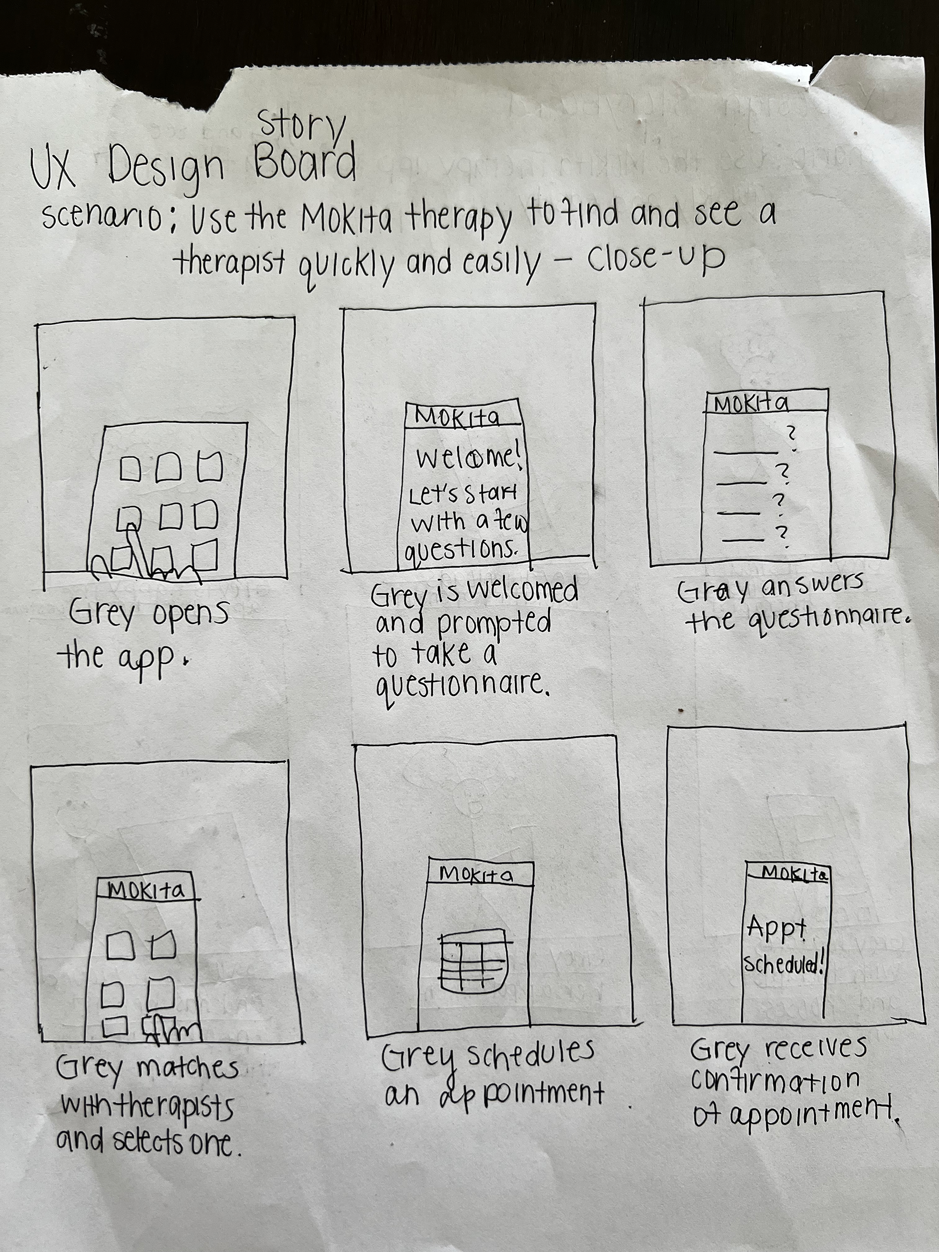
I brought Grey’s story to life through storyboards that would help me convey my concept while again empathizing with the user’s role in the story and their emotions. Creating the storyboard would also help me think about the user flow I would develop later. By sketching out the user’s interaction with the product, I was also able to determine whether or not something may be missing from the flow.
Big picture storyboard (excuse the torn pages!)
Close-up storyboard
I began a competitive audit after conducting user research and creating a storyboard. Since the search and sign-up process deterred my users from booking appointments with mental health professionals, I evaluated direct competitors such as BetterHelp and Cerebral. I chose Headspace as an indirect competitor.
I created a chart of their product offerings, pricing, target user, unique value propositions, first impression of desktop website experience and app/mobile experience, features, accessibility, user flow, navigation, brand identity, tone, and descriptiveness.
After documenting that information, I could evaluate how they positioned themselves in the market, how they spoke about themselves, and their strengths and weaknesses.
A gap that I noticed was the lack of intentional inclusiveness. These websites and apps didn’t define the various mental health professional specializations.
Brand Voice & Tone
Because I wanted to be intentional about the microcopy on the app, I decided to define the voice and tone of Mokita.
I wanted Mokita to be casual, relaxing, helpful, trustworthy, and familiar. The user entrusts us with sensitive information, so we want them to be comfortable. We do not want to appear cold, distant, or novice.
User Flow
Using all of the research I’ve done so far and keeping my conclusions in mind, I drafted a user flow to help inform the frames I would need in my wireframe.
Wireframes & Prototype
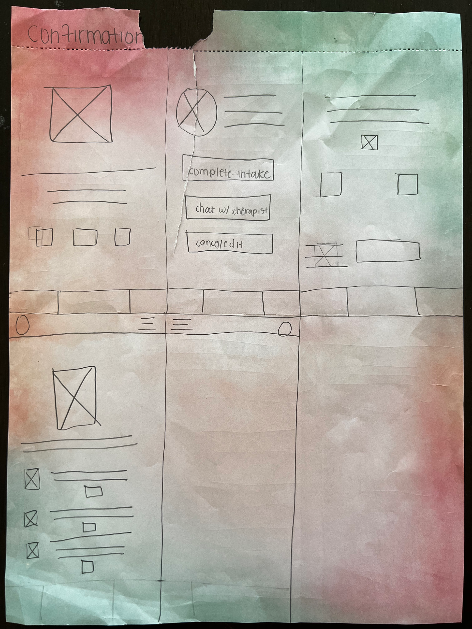
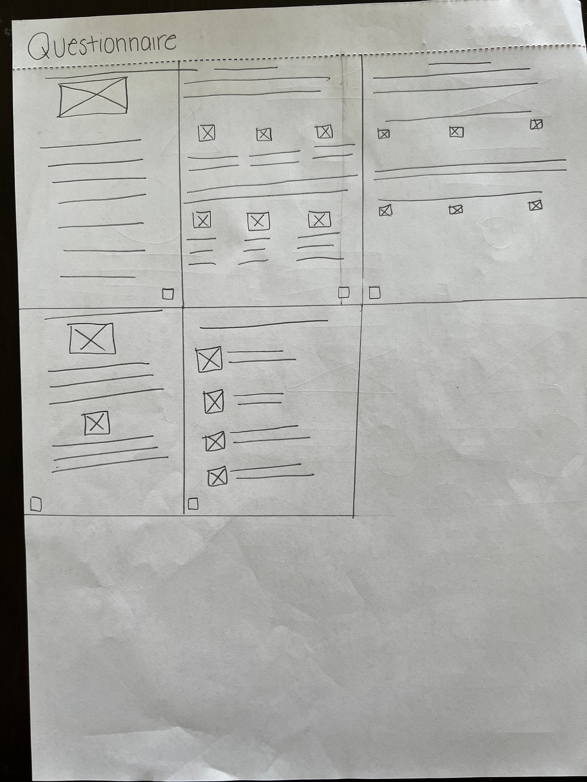
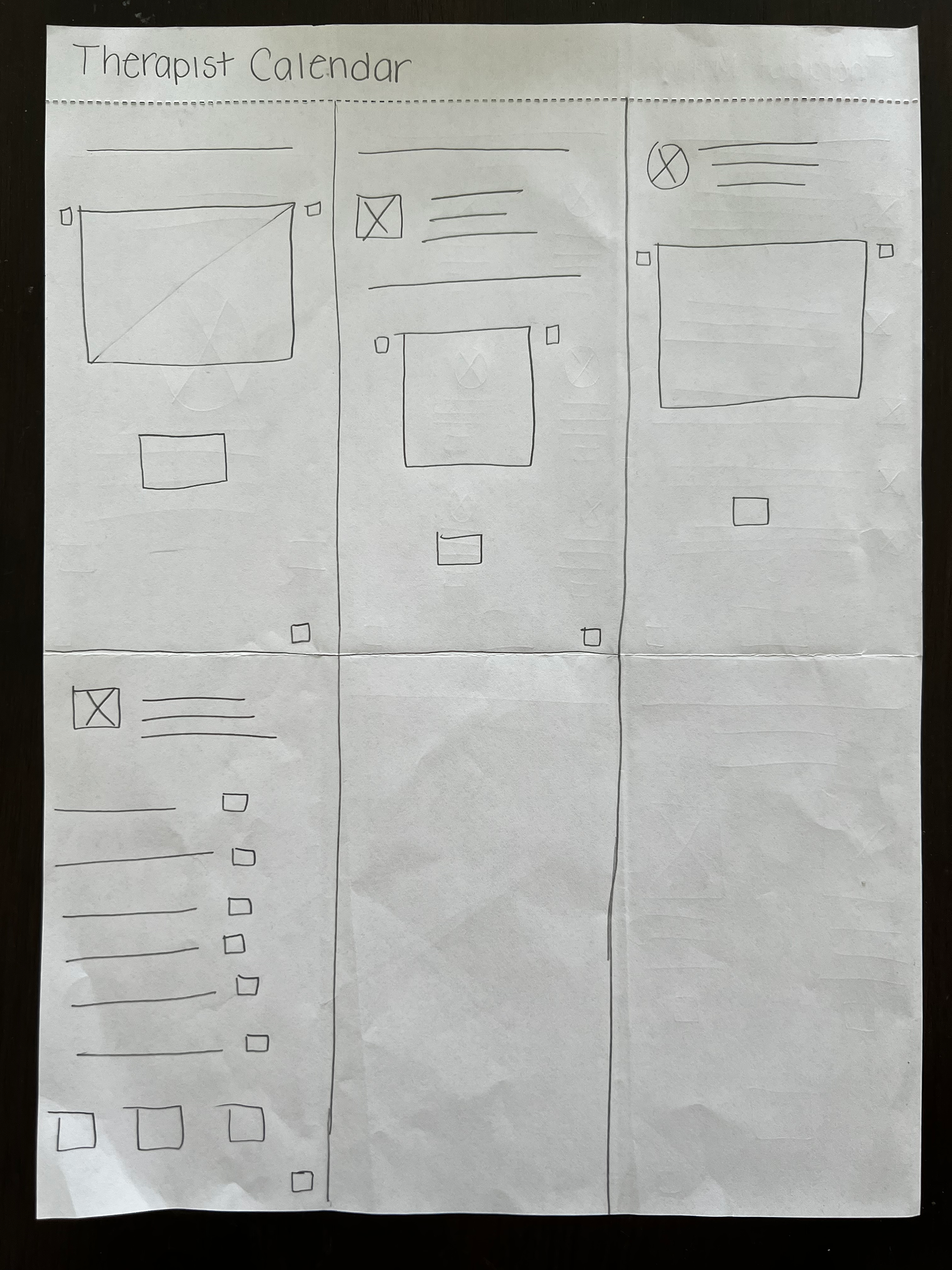
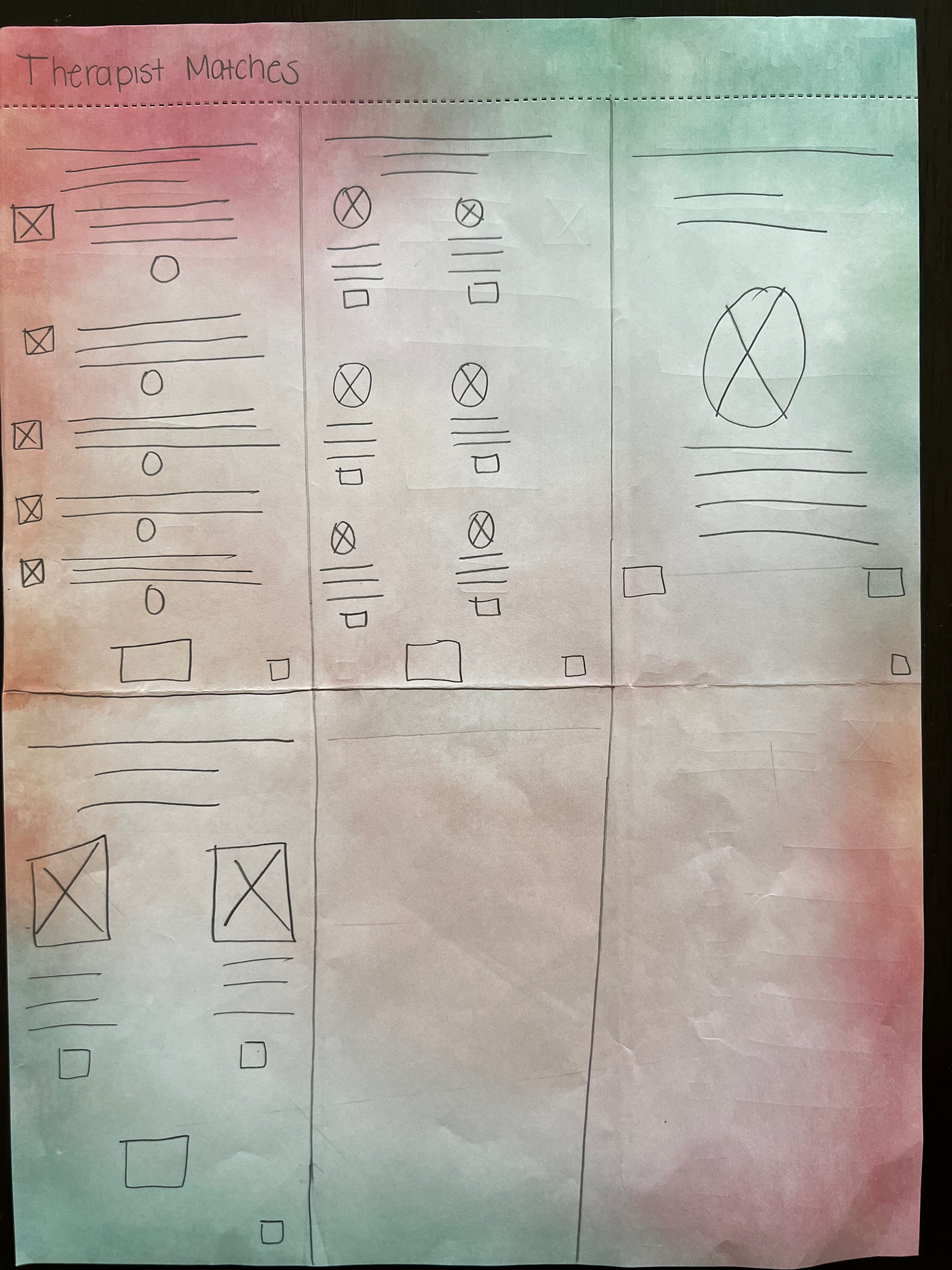
After gathering knowledge about the user and their journey, I drafted wireframes. I also kept the four major user pain points (time, search options, lack of knowledge, and fear of non-inclusiveness) in mind. I know that I needed something succinct that allowed users to quickly find therapists that met their needs despite the users’ knowledge of what specific credentials meant. I also knew that I needed to be intentionally inclusive.
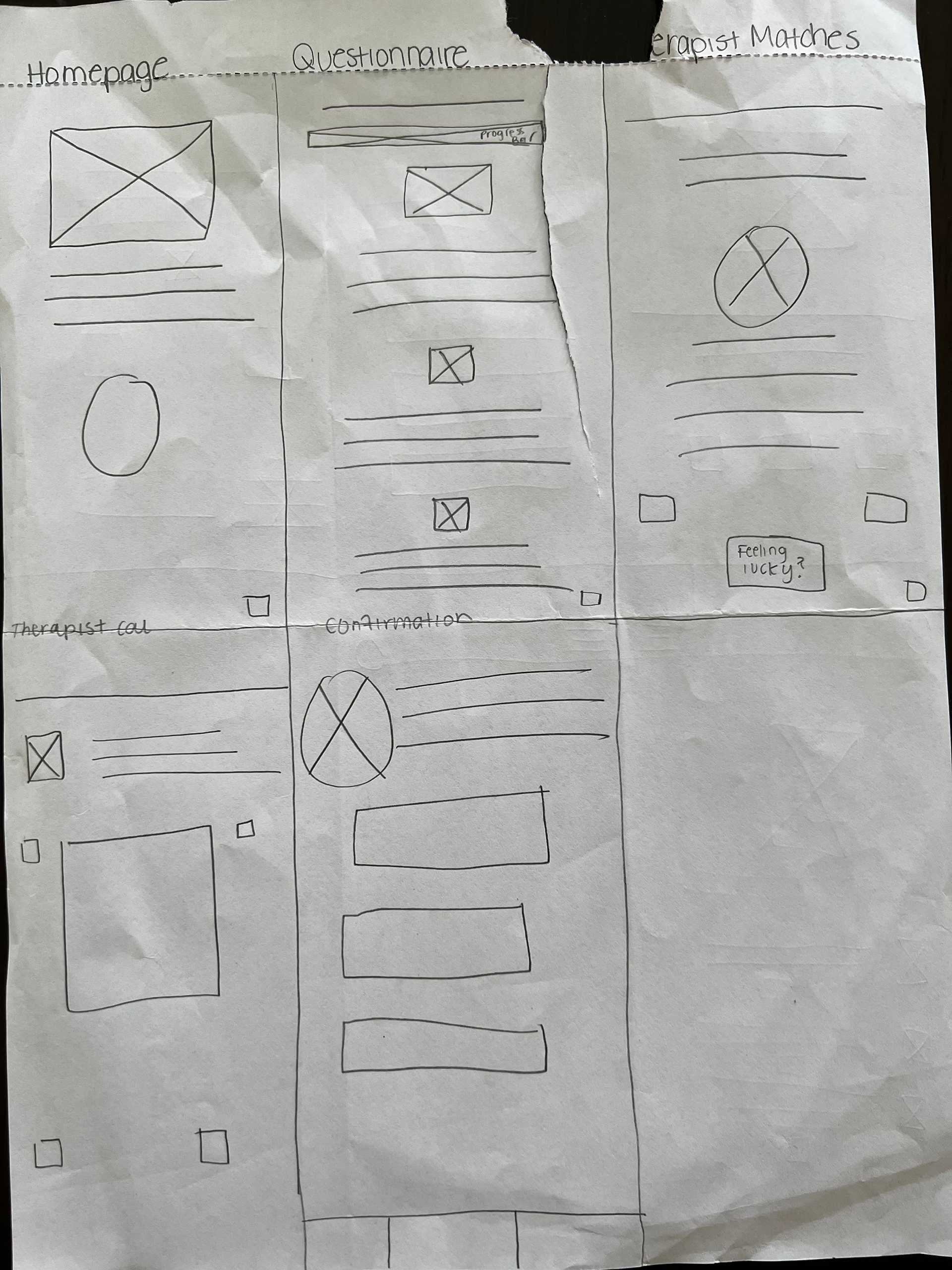
I started with a simple paper wireframe.
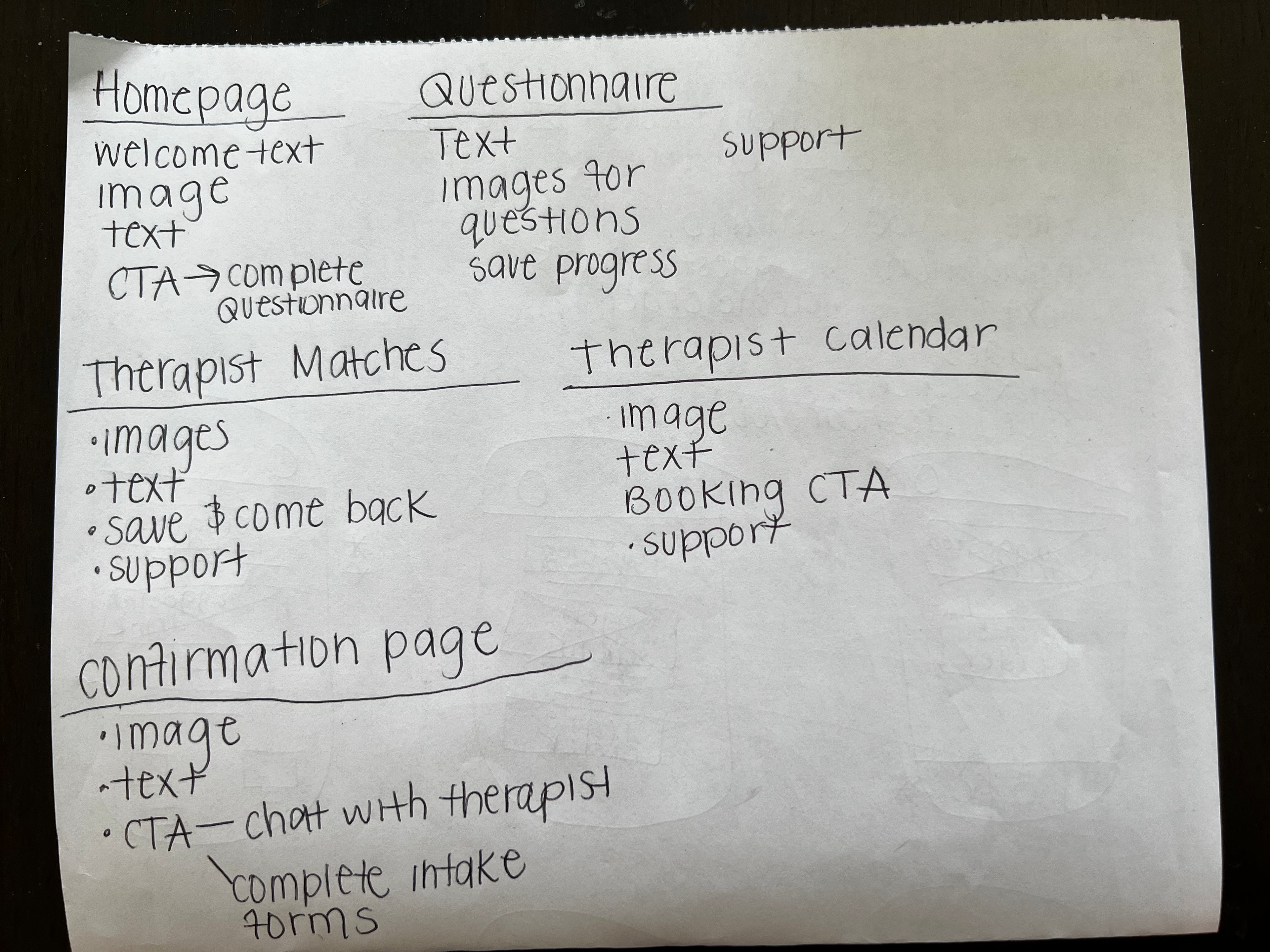
I started by identifying the screens that the product needed. I needed to design a homepage, questionnaire, therapist match page, therapist calendar, and confirmation page. Underneath each set of screens, I listed the components necessary to design the screen. This included text, images, CTAs, etc.
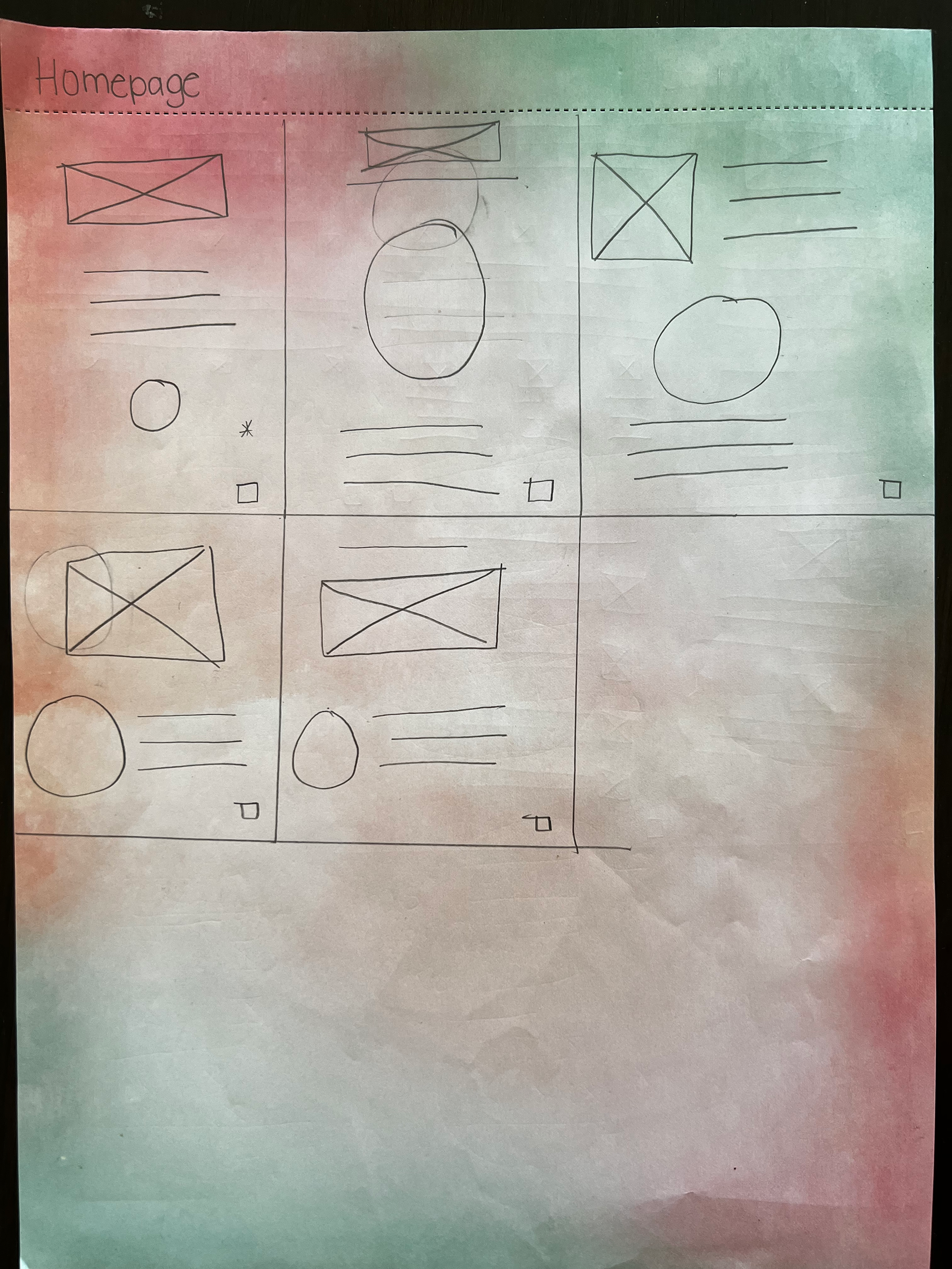
After defining which types of things would be on each screen, I sketched out a few different variations of each screen to give myself layout options.
Throughout this process, I tried to ensure that all designs were simple enough for users to understand so that there would be minimal pain points throughout their onboarding journey. A big concern of my users’ is time, so I needed to design something that would allow them to answer the questionnaire and go straight to booking seamlessly. The users were going to be asked many questions, so I also had to make sure that the flow wasn’t daunting or discouraging. Everything needed to be simple and to the point with clear CTAS.
After designing the paper wireframe, I created a simple lo-fi mockup to iterate on my paper wireframe and digitalize the product. This helped me observe the actual functionality of the app and would help quickly convey design ideas when working with a larger team. I better understood what worked and how things would actually look on a phone screen.
Once I finished my lo-fi mockups, I began mocking up a hi-fi product. Adding color, text, and images to my product helped me iterate the product and make decisions about what things should stay and go. I allowed friends and family to review the prototype and received feedback that helped me improve the product.
Overall, my first few sets of mockups conveyed all of the relevant information but weren’t quite polished regarding presentation and information architecture. There was also an excess of buttons and information on screens that I needed to cut down.
For my final mockup:
- I played with adding buttons versus creating clickable radio cards because I was told there were many distracting buttons.
- I realized that I should separate the questions of my questionnaire versus having them all on one scrollable screen because the scroll made the questionnaire appear long and daunting. I separated all the questions onto different screens and made some options checklists while others were buttons. According to Hick's Law, the more options there are, the longer a user takes to decide. I wanted to reduce this friction. I also chose to abide by Miller's Law by ensuring that questions had seven options or less wherever possible.
- The welcome screen didn’t necessarily appeal to my target audience, so I thought of ways to make it more welcoming for users. I needed something that would make them jump to action. I opted to go for earth-toned colors and images displaying Black women. Mokita’s brand is friendly and inviting, and the colors helped achieve that. The photo of Black women on the screen showed users they were in the right place.
- Fitt's law states that the time it takes to move to a target decreases the larger and closer it is. I tried to achieve this with my initial "Begin questionnaire" button. Instead of just having the “Begin questionnaire” button, I created two switches so that the user would know the outcome of pressing the button instead of just giving them another task to begin. Their size and placement make them easy to access and prominent on the screen.
- I created a screen for a plan selection so that users could choose how they would like to interact with the app, and I created a shorter payment screen.
- I created a linear progress indicator so that users could know how far along the signup process they were. I wanted users to feel that although they were answering many questions, it did not eat away from their time and still aligned with their ultimate goal.
Ideally, after wrapping up my design, I would conduct an unmoderated usability study with friends. My goal is to determine if the therapist search process is quicker in-app, how many people successfully schedule their first appointment, and if the process is intuitive.
My research questions:
- How long does it take for someone to complete the questionnaire and book an appointment?
- How easily can users complete the questionnaire and book their appointment?
- Are there any drop-off points within the questionnaire and initial booking session?
- What can we learn from users' steps to book their first appointment?
My KPIs:
Time on task
Determine how long users can complete the questionnaire and book their first appointment.
Conversion rates
Determine how many users can complete the questionnaire and book their first appointments.
User error rates
Determine if there are any errors that users experience during the questionnaire and booking process.
Using the data I receive, I would go back into the app and see how I could improve to fill any gaps revealed through research.
