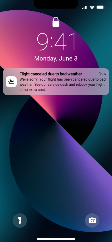
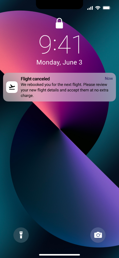
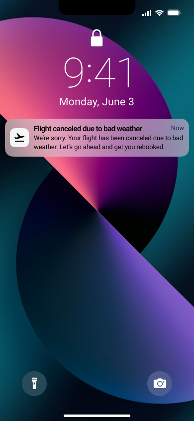
Challenge: Write a message from the airline app notifying them of the cancellation and what they need to do next.
My approach
I approached this writing challenge with a design thinking framework. I needed to understand the user and context, define the problem, get validation through research, brainstorm different variations of copy, refine what I created, and create a prototype to see how the text fit within the context of the app notification. I could not conduct usability testing for this challenge, but that is something that I would typically do.
In writing a notification for an established airline, I expect a tone and voice chart and a user journey already created. Considering the user journey, I identified the range of emotions a customer would feel and the feelings that this friction point would evoke. I asked myself a few questions:
Why did this problem occur?
What emotions are the customers experiencing?
What should they do to overcome the problem?
How can we help them solve the problem?
We aim to craft language that will succinctly let the customer know there is a travel issue and provide them with a simple solution. The experience of having your travel delayed could be a more pleasant one. It is a severe problem. The customer could feel confusion, frustration, anger, and sadness. To overcome this issue, they must go to the service desk to rebook, and we can help them do this by providing them with a conversational, solution-based message that gets straight to the point.
After understanding the user and defining the problem, I sought validation by researching similar messaging from three major airlines: Delta Air Lines, Southwest, and American Airlines. These were my main observations.
Delta Air Lines: Succinct and straight to the point. Mentions no-cost to alleviate the stress of customers. It's an immediate course of action.
Southwest: Wordy but descriptive. Apologetic and empathetic. Provides an immediate course of action and options for customers.
American Airlines: Succinct. Apologetic. It doesn’t mention many details about rebooking—instead, it asks customers to wait until the airline figures out answers.
After conducting research, I brainstormed and created different message variations.
After creating drafts, it was time for refinement. My copy had to be clear, concise, purposeful, and conversational. To best communicate with the customers, it was vital for them to know what I was saying without adding flowery language. I wanted the message to sound human.
One thing that I strayed away from was humor. Because customers were experiencing such a frustrating issue, I wanted them to know that we took the situation very seriously and that our main focus was helping them reach their next destination—as promised.
After I picked the copy that best met my requirements, I began to enter the text into the prototype to see if it fit the overall design. Ideally, we would do this as I refined the text to determine whether or not the text fit. Since the interface would still need to be finalized, I could advocate for more space if the message were too long since shortening it would compromise clarity.
